
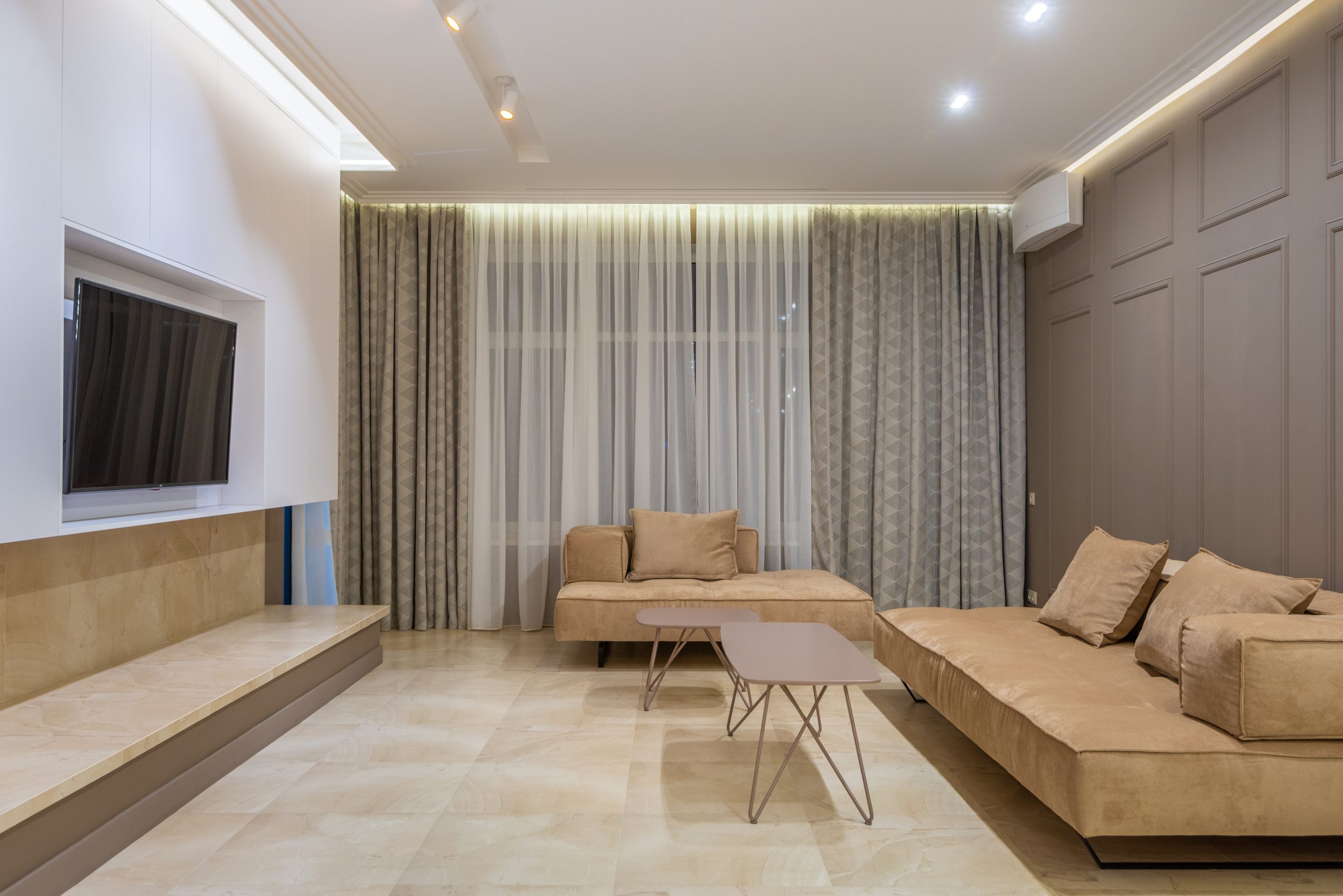
Creating a serene living environment is essential for relaxation and well-being. The right color palette can transform your space into a calming oasis, elevating your mood and enhancing the overall aesthetic of your home. If you’re looking to refresh your living area, consider these top five neutral color palettes that promote tranquility.
In this article, we will explore versatile and serene color combinations that can suit any style while ensuring your home remains a peaceful retreat. Let’s dive into the world of neutrals!
1. Soft Beige and White – Best For Brightness
This palette brings warmth and light into your living space without overwhelming the senses. Soft beige paired with crisp white creates an airy, inviting atmosphere perfect for any room.
Key Features:
- Promotes a bright, airy feel
- Flexible for different furniture styles
- Easy to accessorize with other colors
Pros:
- Creates a sense of space and openness
- Easy maintenance and decor compatibility
- Perfect for both modern and traditional designs
Cons:
- Can feel too plain without accent colors
- May show dirt more easily
- Needs regular upkeep to maintain crispness
2. Grey and Taupe – Best For Sophistication
This sophisticated combination brings depth to your living space while still maintaining a neutral vibe. Grey and taupe create a restful and elegant atmosphere, ideal for sophisticated and inviting decor.
Key Features:
- Rich tones add depth without heaviness
- Versatile for both cozy and modern designs
- Pairs beautifully with gold and silver accents
Pros:
- Adds a touch of elegance
- Can easily transition through seasons
- Great for layering with textures
Cons:
- Can feel dark in small rooms
- Needs good lighting to look its best
- Some shades may clash with warmer tones
3. Cream and Light Grey – Best For Warmth
This warm and inviting color palette offers a soft and cozy feel, making your living space a comforting hideaway. Cream and light grey beautifully balance warmth with coolness, creating a harmonious environment.
Key Features:
- Warm undertones create a cozy atmosphere
- Easy to blend with natural elements
- Creates a balanced and welcoming space
Pros:
- Inviting and warm feel
- Excellent base for layering textures and colors
- Promotes a relaxed, calming environment
Cons:
- May require frequent cleaning
- Can appear dull without accessories
- Lighting can change its perceived warmth
4. Sage Green and Beige – Best For Nature Lovers
This earthy palette connects your living space with nature, bringing a sense of peace and tranquility indoors. Sage green combined with beige allows for a refreshing and serene environment.
Key Features:
- Invokes feelings of calm and relaxation
- Adds a touch of nature indoors
- Great for creating harmonized spaces
Pros:
- Promotes relaxation and stress relief
- Works well with natural materials and plants
- Versatile for various decor styles
Cons:
- May not suit all personal styles
- Can appear muted with poor lighting
- Some may prefer brighter, bolder colors
5. Soft Blush and Cream – Best For Feminine Touch
This delicate palette adds a subtle hint of color while maintaining a soft, serene atmosphere. Soft blush combined with cream creates an enchanting and soothing living space.
Key Features:
- Subtly introduces color without overwhelming
- Adds warmth and comfort
- Enhances femininity while remaining neutral
Pros:
- Creates a light and airy feel
- Ideal for accentuing with metallics or dark colors
- Perfect for any season, enhancing natural light
Cons:
- May not appeal to everyone’s taste
- Requires good lighting to avoid feeling washed out
- Can appear overly soft without contrasting elements
How to Choose the Perfect Neutral Palette for Your Living Space
When selecting a neutral color palette for your home, consider the size and lighting of your space, as these factors can greatly influence the mood and perception of colors. Test small paint samples on your walls to see how they look at different times of day. Additionally, think about the textures and materials you plan to incorporate to ensure a cohesive look.
#NeutralColorPalettes #CalmLivingSpace #InteriorDesign #HomeDecor #ColorInspiration #SereneHome #InteriorStyling